Typography
h1. This is a very
large header.
h2. This is a
large header.
h3. This is a
medium header.
h4. This is a
moderate header.
h5. This is a
small header.
h6. This is a
tiny header.
h1.subheader
h2.subheader
h3.subheader
h4.subheader
h5.subheader
h6.subheader
h1. Small segment header.
h2. Small segment header.
h3. Small segment header.
h4. Small segment header.
h5. Small segment header.
h6. Small segment header.
h6 | This is an h6 with a class of .h1 to alter it stylistically only
h6 | This is an h6 with a class of .h2 to alter it stylistically only
h6 | This is an h6 with a class of .h3 to alter it stylistically only
h6 | This is an h6 with a class of .h4 to alter it stylistically only
h6 | This is an h6 with a class of .h5 to alter it stylistically only
h1 | This is an h1 with a class of .h6 to alter it stylistically only
Fonts
franklin-gothic-urw (TypeKit)
Font Awesome:
1234567890 GNUMICR (UTK)
Lead paragraph
A slightly-larger-than-normal block of text, useful for decks, blurbs, or other descriptive text. Lorem ipsum dolor sit amet, consectetur adipisicing elit. Tempore iusto ipsam, et iste vero facilis.
Normal paragraph
This is a paragraph. Paragraphs are preset with a font size, line height and spacing to match the overall vertical rhythm. To show what a paragraph looks like this needs a little more content so, did you know that there are storms occurring on Jupiter that are larger than the Earth? Pretty cool. Wrap strong around type to make it bold!. You can also use em to italicize your words. You can even use <small></small> tags like so: This is smaller text that inherits its line height
This is another paragraph. Lorem ipsum dolor sit amet, consectetur adipisicing elit. Mollitia maxime eveniet velit. Laboriosam facilis consequuntur praesentium aperiam ratione ducimus, fugiat quibusdam molestias cupiditate, rerum molestiae.
Small paragraph
This is a paragraph with a class of .small-paragraph. It has a smaller font-size and line height, and is a styling class specific to styling small paragraphs. It is separate from the <small> tag, which should inherit its parent's line height. Paragraphs are preset with a font size, line height and spacing to match the overall vertical rhythm. To show what a paragraph looks like this needs a little more content so, did you know that there are storms occurring on Jupiter that are larger than the Earth? Pretty cool. Wrap strong around type to make it bold!. You can also use em to italicize your words.
Subheader paragraph
A subheader paragraph that has a smaller margin top so it sits closer to heading element above and lighter color so it is not as in-your-face. Lorem ipsum dolor sit amet, consectetur adipisicing elit. Nostrum voluptatum rem accusantium tenetur quidem, consequuntur, cum laborum iste magni sed eum pariatur porro reprehenderit. Porro!
Link in paragraph
Links are very standard, and the color is preset to the Foundation primary color.
Unordered list
- List item with a much longer description or more content.
- List item
- List item
- Nested list item
- Nested list item
- Nested list item
- List item
- List item
- List item
Unstyled List
- List item
- List item
- List item
Inline List
- One
- Two
- Three
Carousels
Hero Carousel
Other Carousels
Carousel
Buckets
Menu
Grid
Grid Basics
This is a twelve column section in a row. Each of these includes a div.callout element so you can see where the columns are - it's not required at all for the grid.
Six columns
Six columns
Four columns
Four columns
Four columns
Block Grid
This is a block grid that will reflow and reorder rows automatically
Item
Item
Item
Item
Item
Item
Item
Item
Item
Colors
- $utk-color-primary
- $utk-color-secondary
- $utk-color-tertiary
- $utk-color-info
- $utk-color-success
- $utk-color-warning
- $utk-color-alert
- $utk-color-black
- $utk-color-dark-gray
- $utk-color-med-gray
- $utk-color-light-gray
- $utk-color-white
Forms
Form Groups
Input Groups
Form builder (row grid)
Float Labels
Callouts
Callout
Message Here
Small ButtonCallout for configurator image wrapper

This is a preview image only. Adjustments for layout, sizing, and spacing may be made before printing.
Usage
Modals
Standard Modals
Launch Sign in ModalSign in to your account.
Create a new account.
Pricing Breakdown
| Qty | Price | Total* | |
|---|---|---|---|
| 100 | $1.91 | $191.00 | (Minimum) |
| 200 | $1.71 | $342.00 | |
| 500 | $1.61 | $805.00 | |
| 1000 | $1.51 | $1,510.00 | |
| 2000 | $1.41 | $3,020.00 | |
| 2500 | $1.29 | $3,225.00 | |
| 5000 | $1.21 | $6,050.00 | (Best Value) |
* Total does not include $50 one-time setup fee or shipping costs.
Tooltips
Membership Auth Block
Costco Membership Details
Add your Costco Membership Number to take advantage of special member pricing.*

Where do I find my Costco Membership Number?
* Non-Costco members pay a 15% surcharge (applied during checkout).
Your Costco Executive Member savings have been applied to your cart.
Order Overview
Costco Membership Details
Add your Costco Membership Number to take advantage of special member pricing.*
Where do I find my Costco Membership Number?
* Non-Costco members pay a 15% surcharge (applied during checkout).
Membership Number
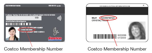
Your Costco Membership Number can be found here.
Search
Site Search
Hello Bar
.hello-bar style (deprecated)
Buttons
Basic Button Types
Button Sizes
Button Group
Split-Link Button Group
Contextual Buttons
Configurator Favorites + Personalize group
Desktop (the PDP desktop side panel)
On hover, the heart button should display a tooltip that says “Add to favorites”. When clicked, this should change to a solid heart and display a temporary toolip message that says “Added to favorites” (disappear after 1.5 seconds). If a user hovers over it after adding to favorites, it should read “Remove from favorites”, and the click message will need to read “Removed from favorites” (disappear after 1.5 seconds).
Mobile (the configurator fixed PDP bar)
When tapped, the heart button should change to a solid heart and display a temporary toolip message that says “Added to favorites” (disappear after 1.5 seconds). If a user taps this button after adding to favorites, the message will need to read “Removed from favorites” (disappear after 1.5 seconds). There are no hover tooltips for this since it is on mobile.
Round Buttons
Slide out button
Progress Button
Icon Buttons
Standard
Animated
Position
Mobile Groups
Accordion
Accordion
-
Title
TEST
-
Configuration
-
Font Awesome
FontAwesome!
Callouts
Callout
Modals
Standard Modals
Test Dialog Modal Launch Sign in ModalSign in to your account.
Note: Your Walmart Promo Shop account is not connected to your Walmart.com account. If you have never created a WalmartPromoShop.com account, you will need to sign up.
Create a new account.
Pricing Breakdown
| Qty | Price | Total* | |
|---|---|---|---|
| 100 | $1.91 | $191.00 | (Minimum) |
| 200 | $1.71 | $342.00 | |
| 500 | $1.61 | $805.00 | |
| 1000 | $1.51 | $1,510.00 | |
| 2000 | $1.41 | $3,020.00 | |
| 2500 | $1.29 | $3,225.00 | |
| 5000 | $1.21 | $6,050.00 | (Best Value) |
* Total does not include $50 one-time setup fee or shipping costs.
Delivery Estimation
-
standardMonday, 7/3$20.66
-
ExpeditedWednesday, 6/28$75.11
-
RushTuesday, 6/27$304.69
Note: These dates and costsa are only an estimate for shipping to <<78256>>. Delivery estimation includes production time, does not account for holidays or unexpected delays, and assumes the product is ordered by 5pm CT today. Exact dates and costs will be shown during checkout.
Production time: 7 business days.
Art requirements modal and link component
Art Requirements
Please review the following guidelines before submitting your logo or image. High-resolution files are required to ensure the best image quality on your custom products.
Best File Formats: Usable Vector Files
-
Adobe Illustrator (.ai) files or .eps files with all fonts converted to outlines.
Note: Changing the file name extension to .ai or .eps does not change the file type.
- Vector PDFs
Acceptable File Formats: High-Resolution Raster Files
Raster files should be the same size or larger than the intended imprint area on your product. Images should be at least 1200 pixels in width or height, but some larger products may require a higher pixel count to achieve an optimal print.
- .eps or .tiff format at 300dpi resolution
- .jpg, .tiff, or .png files that are high resolution (300dpi or more)
Tooltips and Help
ToolTip Types
Desktop Targeted tooltip
Help
Standard Help Text with Tool Tip
Help Text with Modal